Friday 4 December 2015

Film Friday- Banksy

Banksy- Exit Through the Gift Shop

Banksy is inspired by the world. He takes current political, economical and cultural issues and presents them in a satirical form with his unique art work. He challenges normality by pointing out the things wrong with humanity and he disorts our vision of how we perceive the world to show us the problems that are right in front of us, almost giving us new eyes to view the world from.

In my opinion Banksy is exceptionally unique, from hidden identity to his artwork he has formed a message that can't be recreated. Although during the documentary Banksy talks about Andy Warhol and how he "made a statement by repeating famous icons until they became meaningless" and I think that there is an element of that which Banksy channels, he has repeated his graffiti style work illegally hundreds of times until now when they have become respected as artwork, the word illegal is now meaningless when discussing Banksy. Banksy visually communicates this by being an oxymoron, The whole idea of street art is to brainwash, place something in front of someone enough times and their brain will be washed with the image and message that is repeatedly around them. Banksy is repetitive in his signature graffiti style for that reason of brainwashing and his work all has a common message of taking current issues and altering our perception but he also is the opposite to that, he is individually exclusive, he dares to confront different issues and different mediums such as sculpture and living things such as the 'Elephant in the Room' at his art exhibition in Los Angeles.

Banksy is a mainstream artist, he's extremely popular as one of the main modern day artists of the now generation. He's cutting edge with his topical messages that he presents us with, such as gay rights with his work 'Kissing Coppers',  terrorism with his Disneyland Guantanamo Bay display and Slavery with his impactful work of 'Bunting Boy'. He steps out of the box and created something that only he could think of, Banksy's 'Kissing Coppers' which he created as a "symbol of local pride" is innovative and powerful, shocking and meaningful all at the same time. 

During filming for Exit Through the Gift Shop we see Banksy place a figure dressed in prison uniform in Disneyland, this work was to "highlight the plight of terror suspects" in Guantanamo Bay. This is a clear representation of how Banksy chooses to challenge establishments such as law enforcement. 
He also goes for more broad subjects like in his exhibition in America 'Barely Legal' he camouflaged an elephant with 12 liters of children's face paint in a statement of how easy it is to ignore things that are right in front of us. 

This is almost a summary of the reason why Banksy's other work important, his art has the ability to show us the things that are right in front of us, he makes it in such a way that people are incapsulated by the issues that are important in today's world.


Megan Chilcott

Artist Statement- The Square

Megan Chilcott 

In 2D I have chosen one of my paint life drawings as my final piece. I was inspired by Picasso because he is a cubist and uses very bold lines and saturated colour.
In 3D my final piece is my frame based on the human form. I decided to make it a little bit personal as I enjoy doing prosthetic make up which inspired me to make the sections of skin frame.
In Time Based I took pictures using LED lighting of the human body. I chose and edited my two pictures that were the strongest in form and tonally.

The Square- Life Drawing

In 2D we learnt about how to express the human forms using different techniques. 

Week 1 we used charcoal, we began doing various continuous line drawings. This gave us the ability to make it abstract, details didn't matter with a continuous line as it communicates freedom.
The context of which the image is in is important as well, it leads to a more complex composition and gives more meaning to the work.

Week 2 we used both charcoal and chalk, this gave us shadows and highlights making the model look more 3D. This visually communicates the realism of the subject matter and gives it more depth than just the charcoal.
We also learnt about foreshortening, foreshortening is making a realistic scale. The nearer the body part, the bigger it is on paper. This proportioned shape and form visually communicates a more organic image.

In week 3 we began to use colour, we primarily used saturated primary colours which made the pictures look very abstract against the bold black lines, this visually communicates contrasting emotions.
The final picture is a movement picture, as the model moved we had the challenge of painting him. This lead to a very abstract piece of work with various anglular, converging and scratched lines visually communicating an erratic movement and emotion.


Megan Chilcott


The Square- 3D Final Piece

In 3D we were asked to adapt a frame inspired by human form. Due to my love of prosthetic make up I knew pretty much exactly what I wanted to produce straight away, so I created an initial sketch: 
The idea was to make the frame look as though different skin colours were stitched together, initially it was to show love and diversity despite race but by the end the message changed slightly.

I began using plasticine to create the skin like sections, I then pasted liquid latex over the top to give a skin like feel, after a couple of coats of the liquid latex I decided not to use it as it was very stretchy and it wouldn't be thick enough for what I wanted, so I changed from using liquid latex to using PVA glue. I also decided not to got all the way around the frame, I thought that some areas should be exposed in order to show what it actually represents.

I then started created a face out of clay, at first I was going to do a plain expression but I decided to make it a more angered expression. This was the final product, I like how devil like he looks, it adapts the message slightly.

I then painted my frame and skin sections. To make it more realistic I used foundation and face paints although I forgot that these don't withstand a lot of touching so after a while they started smudging and becoming full of gaps.

I didn't really want to go in with paints as I thought it wouldn't look very realistic so I kept the foundation and face paints as I like how it made it look as though the skin it dying away.
This is my finished piece, I wish I'd had more time to make it look more polished.

I made an edit of what I would've wanted it to look like....
But overall I believe that I achieve what I wanted to achieve and it uses intense clashing colours to visually communicate a feeling of hate due to discrimination.


Megan Chilcott


Time Based- The Collective Photography

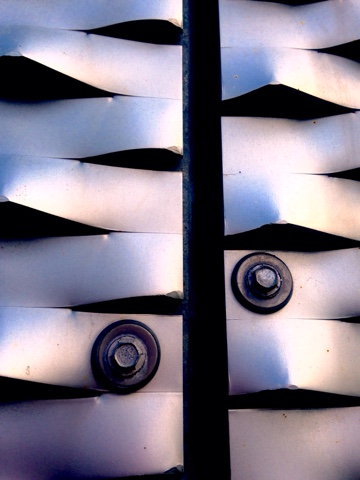
In Time Based we photographed and edited our collective subject matter (metal) these are my edited pictures, I tried to zoom in to the metal to show the rough, course rusty texture this visually communicates a heavy, structural industrial material being weakened by nature. 


Megan Chilcott

Thursday 3 December 2015

The Square- Evaluation- 2D Life Drawing

Evaluation

I'll be evaluating my piece of work below which I created in 2D during a life drawing lesson.

To get to this final piece of work, I through stages of working with just black paint to working with lots of colour. Below you can see the progression of the different life drawings. To me the bold black paintings were very strong, the lines visually communicated a simple feel of freedom and life. Although I wanted a more intense feel of heavy emotion and that's why I wanted to introduce colour.
I believe that my final piece is visually communicating a sense of inner conflict. In my piece I have two types of lines, the black lines are erratic and the almost pace around the page, contradicting this, the red lines are angular and bold, this visually communicates a sense of contrasting emotion, the lines are almost fighting one another, giving a feel of self hatred. The tone of my final piece is harsh and sharp, this is created with bold, stand out lines which gives a one dimensional feel to the being in the piece, but it also shows a strong meaning feel of life and emotion as it hides away from being three dimensional. I used very saturated and intense colours, the black and red represent hate and anger, it communicates the being dealing with his heavy emotions weighing him down which shows his struggles. The shape and form of my life drawing is contrasting, it's organic versus geometric. The organic shapes have been placed in a geometric box and they communicate the feeling of being out of place and like they don't belong there, this links with the previous contrasting lines. Overall I didn't really think too heavily about texture when creating this piece which lead to a very natural dry and layered texture, the layering communicates the feeling of building stress. Almost as though problems are stacking up on top of the being. The pattern on my final piece is very irregular and asymmetrical, to me this communicates a feeling of being out of control, it shows that the being doesn't feel as though they have a hold on their life and they're overwhelmed. Finally the matte, dry sheen of the final piece communicates an unpolished life. The matte paint makes it look almost unfinished, which represents the feeling of not living up to ones full potential and not living life to the full which can feel very straining on the mind.
Overall my piece visually communicates someone's self battle with anger and hatred, this is shown by the contrasting lines and heavy, saturated colours. I believe that the emotive life drawing has a very strong meaning which is looking at the seriousness of mental health in today's society.

I looked at Picasso for inspiration m, he's one of not the most famous cubism artists of all time and I really wanted to capture the idea of cubism in my piece as I believe it visually communicates a feel of seriousness as well as being playful, it almost had two sides, a darker side of bold and fluid line and contrasting that it has an almost harmonious side with vibrant, instead colours. I felt inspired by this contrasting style of work.

Blue Nude-1902 Picasso
I drew inspiration from Picasso's 'Blue Nude', I like the idea of a very simple bold line image being transformed by colour into a painting with such strong emotion. Similarly both Picasso's work and my own don't include a background, for me this was very important as I wanted to visually communicate the anger and sadness purely from the contrasting sharp and erratic lines. Picasso has used tone in the layered blue to visually communicate the feeling of loneliness and rejection, in contrast to Picasso's work I chose not to use tone and instead I used very saturated colours. I did this to visually communicate a war between the bold black and the solid red, furthering my idea of contrasting the lines against one another which shows inner turmoil in fighting emotions within ones self.


Megan Chilcott


Contextual Studies- 02.12.15

How people get their message across.

George the Poet- 'Mother Tounge'
-20 year old Cambridge university student. Talking about how he felt excluded when he went to Uganda as his mother could speak the tongue but he couldn't. Used a lot of alliteration, 'desperate, dispossessed', this highlighted his anger. 

Anish Kapoor- BBC Series 'Imagine'
-Uses novel like language. Mysterious object emerges from the landscape, eerie music is used to show disorientation. Reconfigured space. C curve. Overwhelming expanse. Both complex and simple.

Andrew Graham Dixon on Bridget Riley
-A critic who talks about the work of Bridget Riley, an optical artist 'Op Art'. He relates her work to one of an old master and he's very abstract in how he goes about it. Surging, almost musical piece of art. Riley's work dances, moves and pulses. Both use colour rhythm, flows. Uses very complex words when evaluating the two works against each other.

Mark Kermode Rants: Pirates of  the Caribbean 3.
-Film critic who believes the movie is misguided for a family movie as the film contains moderate horror. Criticises the actors. Mark believes lots of plots make for an out of kilter film. Went to town on slagging the movie off.


Megan Chilcott

Time Based- Human Form & Time Based Final Piece

In Time Based we learnt about the 'rights of expression', I got the following from the website Liberty.
"Article 10 gives everyone the right to freedom of expression, which includes the freedom to hold opinions and to receive and impart information and ideas without State interference.
This includes the right to communicate and to express oneself in any medium, including through words, pictures, images and actions (including through public protest and demonstrations)."

This shows that there aren't any limits in how to express yourself through art. Although in Time Based we learnt the limitations of our photoshoot, we had to take into consideration the type of audience that would be viewing the pictures (family) and the safety of putting more private areas on display at a college exhibition, this means that's the areas we were aloud to photograph were areas such as, hands, feet, faces, hair and necks. This way the exhibition would be family friendly and all on the same guideline.

Knowing our limitations we went ahead and took our photography, we used a high powered LED light and a Canon DSLR camera, this would make sure we had the best quality pictures possible and by adjust light settings and heights we could change the form through highlights and shadows making for well composed image.

Here are my Human Form photographs:


I'm very proud of my images, I believe that they all capture a strong message.

Next I edited two of them:
I believe that by bringing out the luminous colour on the lip and subduing the image rest of the image it gives a contrasting warm and cold intensity to the photograph.

By making the image black and making the shadows harsh and the highlights soft, I believe I have achieved an atmospheric image. It shows strength and power. Although if I was to go back I would perhaps try to get the whole subject matter into the frame, I think this would intensify the image further.


Megan Chilcott


Time Based- Studio Lighting and Creating Form

In Time Based we learnt how to create form in photography using lighting. 
I took a few notes:
-Use the barn doors on the light to concentrate the light.
-Use a stronger setting of light to create a more intense form with stronger shadows and highlights.
-Use a weaker setting of light to create a softer form with a more naturally 3D look.
-Raise or lower the light in order to get a different form and shadow angle.

Here are some of the pictures I took along with diagrams of my setup:


Next time I would instead move the object closer to the camera and light, this would give a more atmospheric and professional feel to the structure and proportion of the the form.


Megan Chilcott


Time Based- Theory of Composition

In time based we learnt about three different ways to compose a photograph in order to make it aesthetically pleasing.

Rule of Thirds
-The picture is split into 9 sections, in order to make it a good composition the subject matter or matters have to lay on an intersection in the thirds. 
Here is an example I took:
As you can see the foreground is the first third of the picture, the midground takes up the second third and the background completes the rule of three.
In my composition the various sharp angular lines of the city contrast against the soft blurred background, this gives the feel of natural versus synthetic.

The Golden Triangle
-The pictures that have a lot of diagonals use this rule, the rule means that the picture is sectioned into various triangles in order to compliment the angular style to the picture.
Here's an example I took:
From this picture you can see that the various rising and falling of the lines makes for a layered affect this draws the eye forward and back through the compostion.

The Golden Spiral
-A picture that has a golden spiral compostion is one that leads the eye around in a spiralling shape and eventually leads it to the centre of the composition, it doesn't necessarily have to be a picture of a spiral/circular shape it just needs to lead the eye towards the centre. 
Here's an example I took:
From my picture you can see that because of the geometric lines and structure every part of the photo eventually leads to the middle, this shows that even the most simple objects can be a complex composition.


Megan Chilcott