The Others - Evaluation

My initial idea was based around how war and destruction affects young people in third world countries. I was inspired by a girl called Phan Thi Kim Phuc, who was photographed at the age of nine during the Vietnamese war, the photograph shows her naked running on a road after having her back severely burnt by the South Vietnamese napalm attack on June 8th 1972. Through using Phan’s story I wanted to create a pot that shows innocence and youth being damaged, I came up with an idea to make a pot that has one side completely smooth and the other side altered in some way. After going through some design ideas I chose to make the pot into a shape of a torso and have the back of the pot look as though it is melting or being burnt. This symbolises Phan’s pain literally and metaphorically and shows that through this torment her innocence has been stripped from her.
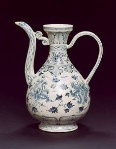 To help me help me understand Vietnamese culture I chose to research traditional Vietnamese designs on pottery. I came across blue and white porcelain which is very soft and intricate designs traditionally with crisp white and cobalt blue. [1]I found that the majority of the late 14th/early 15th century Vietnamese blue and white consisted of wares decorated with floral or cloud like motif. There are spur marks on the inner base of bowls and plates. The second half of 15th century was the golden period of Vietnamese blue and white. During this period, the Vietnamese potters introduced their unique style of decorations and many new innovative vessel forms. Archaeological surveys revealed that two districts in Hai Duong Province, Nam Sach and Binh Giang have the greatest concentration of kilns that produced blue and white wares. Among them Chu Dau in Nam Sach and Ngoi kiln complex in Binh Giang were the biggest producers. With this information and with help from pictures of this pottery I began drawing out some designs and trying to encapsulate the Vietnamese culture with these designs.
 When it came to making the pot I had no problems, the shape was just as I envisaged and with hindsight I think that I should have just left it there as it would have come out crisp and white. But I decided to attempt the traditional Vietnamese pattern of the cobalt blue intricate designs and on the melted affect side I decided to place blue on the drips. While doing this I found it very difficult, the colour wasn’t going on great as it was heavy in some areas and barely noticeable in others, also the colour wasn’t the cobalt blue I was hoping for, it was more or a turquoise. I knew that it wasn’t going to be great so once it was fired I decided not to glaze it as I didn’t want money to be wasted on something that I wasn’t proud of.
  The successes on this project have been the research, I enjoyed looking into young people's lives that are struggling a lot more than people in the world we know are and seeing the strength of Phan Thi Kim Phuc after the pain that she went through as a nine year old girl. Also I believe that the shape of my pot was very unique and different and I think that it showed the message of innocence being ripped away from this young people who have to face war every day of their lives. Having looked at all my successes I also recognise that there are targets I need to set myself to enable development. These are taking more time to think about what I’m doing, if i had spent more time thinking about the design of my pot and planning it out more thoroughly then maybe my pot would have turned out how I wanted it to. To conclude I believe that I showed the message that I wanted to but I didn’t necessarily do it to my best ability and I could have improved it had I spent more time on the planning.
Megan Chilcott
[1] http://www.koh-antique.com/vietceramics/vietceramics2.htm


